The private I? Me and my home
17 June 2014 | Reviews
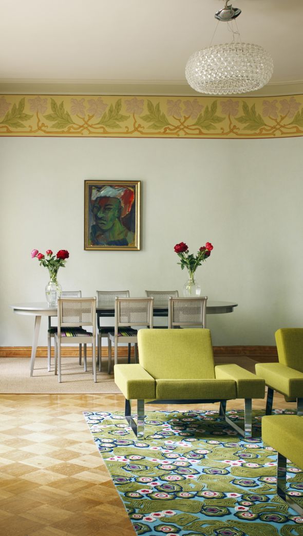
Art Nouveau with a modern twist. Photo: Avaimia ajattomiin suomalaisiin sisustuksiin / Jaanis Kerkis
Avaimia ajattomiin suomalaisiin sisustuksiin
[Keys to timeless Finnish interiors]
Design: Hanni Koroma, text: Sami Sykkö, photographs: Jaanis Kerkis
Helsinki: Gummerus, 2014. 123 pp., ill.
ISBN 978-951-20-9507-0
€32.90, hardback
Katja Lindroos
MOMO. Koti elementissään
[MOMO. The home in its element]
Photography: Riikka Kantinkoski, Niclas Warius
Helsinki: Siltala, 2013. 154 pp., ill.
ISBN 978-952-234-164-8
€32.90, hardback
www.momokoti.fi (in Finnish only)
‘Interior decoration’ has become an extremely popular pastime in Finland – as elsewhere where the standard of living allows it.
Innumerable magazines and blogs keep churning out photos of rooms with large white, cushioned sofas, glossy white kitchen cabinets and white floors on which furniture seems to float forlornly. Walls are decorated with wooden or metallic letters forming words: love; home, sweet home. In the kitchen the bread bin bears the word BREAD. (Bookcases, with actual books, are rare.)
Why is it that in our age which worships ‘individuality’, trends rule?
Stop the letter madness – and the white nonsense, please! Rat labs and obduction rooms are white boxes, and even they may look cosier than those featureless glossy white kitchens with their huge steel fridges. In a country with long bleak winter months, white furniture and surfaces just create chilly-looking spaces. White must equal ‘excellent taste‘ in people’s minds – why else would it be so popular?
Instead of being designed, interiors are ‘decorated’, but a better term would be ‘dressed’, or even staged. Homes are made to look like still lives, uninhabited: no traces of actual life anywhere. OK, perhaps sixteen limes in a bowl? Of course we know that everything is only for show, in photos: very, very few homes are not more or less cluttered. We are presented with ideals: dream on.
Featuring trendy stuff makes magazines thoroughly unattractive to anyone who dislikes trends; interesting interiors are, to some extent, connected to design. ‘Design’ doesn’t only manifest itself in six-bedroom luxury houses in expensive areas or cool new studio flats in fashionable parts of the city: it is not just money that matters. Timeless, original, intelligent, well-functioning interiors that also take the building and its characteristics into consideration, are created with patience, time, originality and – dare I even say it ? – good taste.
These are rare properties. After having spent years by visiting hundreds if not thousands of homes online as a tentative buyer, I claim to know a great deal about contemporary Finnish homes. I have to admit I have become particularly partial to the originality of materials – a well-preserved old oak parquet should not be painted glossy white; if the doorways are originally angular, they should not be transformed into Andalusian arches, and I do not like laminate floors imitating wood either, sorry!
Everyone should naturally have a home that pleases him or her best. Home is a most private space, but for the first time it is now possible (Internet, social media), and consequently trendy, to make it ‘public’. Because it is so private, emotions related to interiors are powerful: opinions for or against are quickly formed.
The magazines have to fill their pages regularly, which often results in eye candy, a stream of colour photos of inexpensive, accessible objects that anyone can immediately buy online to ‘decorate’ one’s home with, and page after page trendy homes with their identical ideas.
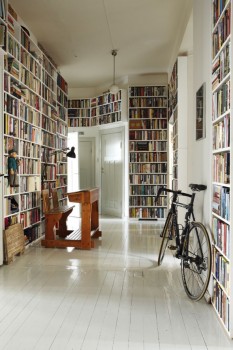
Home for books. Photo: Avaimia ajattomiin suomalaisiin sisustuksiin / Jaanis Kerkis
Occasionally books on interior decoration are published to participate in the conversation about spaces, colours and objects.
Avaimia ajattomiin suomalaisiin sisustuksiin is a collection of interiors designed by Hanni Koroma; the texts are written by Sami Sykkö and photographs are by Jaanis Kerkis.
There are a few white-floored homes, but the book features spaces that have been custom-built for their inhabitants. True, most of the homes featured are on the large side and owned by their inhabitants: money does buy both space and design.
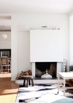
Interior designer Hanni Koroma specialises in space and colour. The hallway – right – in a hundred-year-old apartment takes up almost a third of the square metres, so it was furnished with custom-made bookshelves.
Never use builder’s white, a cold, grey-tinted basic white: it is hostile to anything in a home!
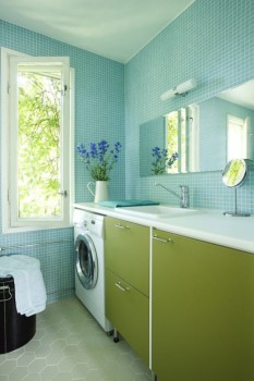
Natural colours. Photo: Avaimia ajattomiin suomalaisiin sisustuksiin / Jaanis Kerkis
The views from the windows and the colouring of the building opposite should also be examined when choosing the colours of a room: see the green-blue bathroom, left.
It is not often that rooms are ‘too’ high, but, as seen in the first photo of an apartment in a period building, a broad border – in this case, with Art Nouveau theme – seems to make the wall appear more proportionate.
A large mirror placed strategically creates an effective illusion of space, and so does an enlarged doorway. Kitchen cabinets are expensive, so it is worth making exact calculations of the space needed. The designer also advises to study the colours of the house and of the era.
The interiors featured in this book are calm and well thought-out, cheerful or sophisticated, and the photographs show the rooms properly (their dimensions, the placing of furniture, colours), not concentrating on details of objects.
‘Modest modernism’, MOMO, is a term that is, in the book by Katja Lindroos, applied to Finnish houses built in the 1950s, 1960s and 1970s. In Finland as many as 70 per cent of apartment houses were built after the Second World War, and the majority of them in 1960s and 1970s.
Standardisation was the new ideal: new homes for ordinary people with growing families were in demand after the war. The great move from the country to towns had begun.
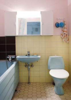
Colour rules: a ’70s bathroom. Photo: MOMO / Riikka Kantinkoski
Each decade had its own particular features in building and in design. Colours were subtle in the 1950s, but strong in the 1970s – brown, orange, red and green paint ruled – perhaps it is not such a wonder that builder’s white gained overpowering control over the country in the following decades. But in homogenous Finland, trends stay on and become rules….
Ways of living have greatly changed. Electric appliances require plenty of sockets and space. In the 1950s rooms were small, and so was furniture. Unlike now, evenings at home were not spent by lying flat en masse on an angular, massive divan sofa in front of the telly. Storage space was scarce, as there was not much to store – unlike now.
The MOMO homes featured in the book have been renovated to match modern lifestyle by updating kitchens and bathrooms.
One cheerful exception is the 1970s bathroom – see the photo, right – where the typical pastel colours and materials are still in use. No white tiles and fittings here! Now, pink or yellow toilet seats are sadly obsolete.
Not all the inhabitants of the homes featured in the book have chosen to apply the style of the original design to their home; a 1950s small flat has been fashionably transformed into a gleaming white box, the oak parquet painted white. A 1960s house has been modernised with many fewer changes.
Works well: a ’50s living room. Photo: MOMO / Riikka Kantinkoski
However, in that decade better, durable and more expensive materials as well as more choices were already on offer (wall and floor coverings, ceramics, fittings), thus more worth preserving. In the 1970s houses typically kitchens were small, so in renovation projects walls may have been taken down between rooms.
The decades of ‘modest modernism’ saw the expansion from the city centres to the suburbs: the building industry boomed, creating new homes for hundreds of thousands.
Unfortunately the standard of construction did not keep up with the development: now massive renovation projects have hit not only the 60-year old 1950s houses – for more ‘natural’ needs to remodel – but also the masses of the 1970s houses, 20 years younger.
Among the numerous photos in MOMO there is a plethora of details which illustrate characteristics of the decades and the homes featured. However, as there are no captions and descriptions must be looked for in the copy, reading the book occasionally resembles leafing an interior decoration magazine.
Modest and modern: Photo: MOMO / Niclas Warius
MOMO aims at promoting post-war housing architecture; perhaps 1950s buildings have now already become ‘vintage’ and are appreciated by young home-buyers. Apartment houses dating from the 19th century, the Art Nouveau /Jugend and the Art Deco /Functionalism periods in Finnish cities have a firm fame, but the 1970s suburban blocks are yet to gain appreciation.
As cities have kept growing, suburbs are now much more accessible; they are also able to offer greenness, recreational facilities and much cheaper prices, which certainly is an advantage to home-buyers – and so to those who are into interior decoration.
‘Space and light and order’ are the things that everyone needs, as well as bread and place to sleep, Le Corbusier believed. These – or perhaps sometimes even their illusions, created by interior design? – are worth pursuing in making any home a trustworthy place for me being me.
Tags: design, interior decoration
No comments for this entry yet